A Simple Guide to Typography for Photo Booth Overlays
Welcome to the world of typography! We understand that choosing the right font for your photo booth overlays can be a bit overwhelming. Don't worry; we're here to simplify it for you. Typography is an art, but it doesn't have to be complicated. Choose fonts that complement your photo booth overlays and enhance the overall experience for your users. Keep it simple, consistent, and have fun creating! Here are some basics to help photo booth owners grasp the essentials of typography without overwhelming them with unnecessary details.
Typography Basics:
Let's transform the seemingly intricate world of fonts into a creative asset that effortlessly enhances your snapshots. Ready to make your overlays pop? Let's dive in!
Font vs. Typeface:
- Font: Refers to a specific style, size, and weight of a typeface (e.g., Arial, Times New Roman).
- Typeface: The overall design family that includes various fonts (e.g., Arial typeface includes Arial Regular, Arial Bold).
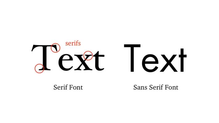
Serif vs. Sans Serif:- Serif: Fonts with small decorative lines or tails at the ends of characters (e.g., Times New Roman). Classic and formal.
- Sans Serif: Clean, without decorative lines (e.g., Arial). Modern and easy to read.
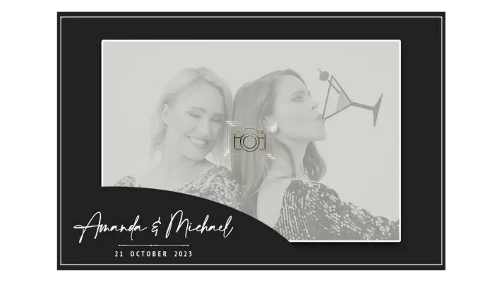
Using Script Fonts for Captivating Photo Booth Overlays
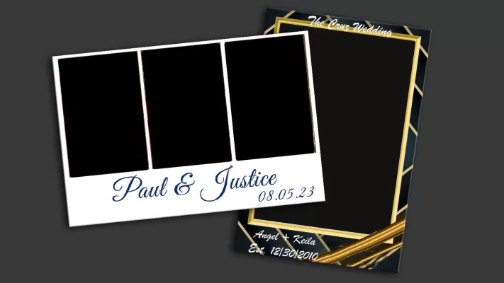
Script fonts are ideal for formal occasions such as weddings, galas, or upscale corporate events. They exude a sense of sophistication and add a personalized, handwritten touch to invitations or event details. Remember, readability is crucial, so it's essential to use script fonts sparingly and in appropriate contexts. They can be highly effective when applied judiciously to specific elements within your overlays, enhancing the overall visual appeal of your photo booth overlay template.
Using Serif Fonts in Your Photo Booth Overlay Designs
Using a serif font in a photo booth overlay template can be a strategic choice. Serif fonts, with their classic and refined appearance, are perfect for formal events like weddings, black-tie galas, or corporate functions. They impart a sense of tradition and elegance to the overall design. Serif fonts are often associated with professionalism, making them suitable for corporate events, business conferences, or networking functions. They impart a sense of reliability and formality. When applied thoughtfully, serif fonts can enhance the visual appeal of your overlays.
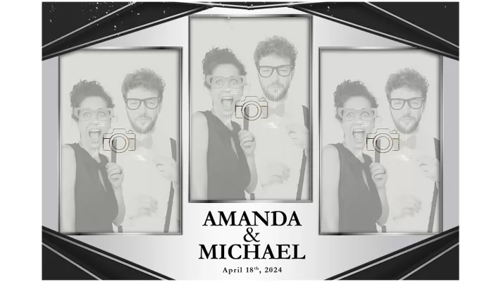
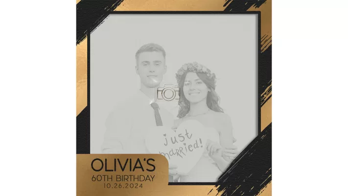
the Modern Allure of Sans-Serif Fonts in Photo Booth Overlays
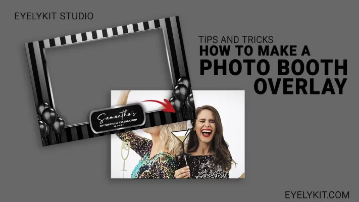
Sans-serif fonts are well-suited for contemporary and modern events. They convey a clean and sleek aesthetic, making them ideal for parties, product launches, or any event with a modern theme. If your event involves brand activations, marketing, or corporate product launches, sans-serif fonts can give a modern and professional touch to your overlays, reflecting a contemporary brand image. Sans-serif fonts pair well with script fonts. Use sans-serif for main information and script for accent or personalized details, creating a balanced and visually appealing composition.
Font Harmony in Photo Booth Overlays:
The Dos and Don'ts Guide
Let's walk you through the basics dos and don'ts, providing invaluable insights to ensure your designs strike the perfect balance between style and functionality.
the dos
- Prioritize Readability: Choose fonts that are clear and easily readable
- Align with Event Theme: Tailor font choices to match the theme and mood of the event.
- Balance Font Sizes: Establish a hierarchy by using different font sizes. Larger fonts for crucial details and smaller fonts for secondary information
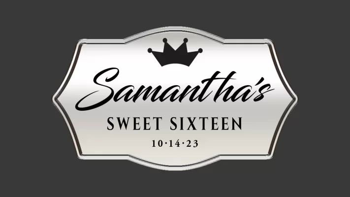
- Experiment with Font Pairing: Explore combinations of serif and sans-serif or mix decorative scripts with simple sans-serifs.
- Use Script Fonts for Personalization: Integrate script fonts for personalized touches, such as names or custom messages.
the don’ts
- Avoid Overly Ornate Fonts: Choose fonts that are clear and not excessively decorative.
- Don't Mix Too Many Fonts: Stick to a limited selection of fonts. Overcrowding your design with too many different fonts can create visual chaos
- Steer Clear of All Caps for Long Text: Avoid using all capital letters for extended paragraphs. Uppercase text can be harder to read, especially in large blocks.
- Don't Sacrifice Readability for Style: Prioritize readability over style. Ensure participants can easily understand the information presented,
- Don't Neglect Hierarchy in Font Sizes: Neglecting to establish a clear hierarchy in font sizes can lead to confusion.
