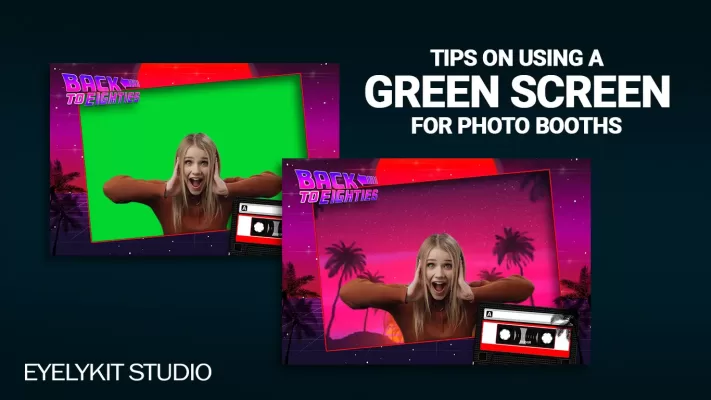
How to make an
Overlay
Photo booth template
Overlay
Photo booth template
Overlay Magic: Crafting Picture-Perfect Photo Booth Templates. Unlock the secrets to creating professional and eye-catching photo booth templates. From keeping it simple to adding tasteful touches of sparkle, these tips will help you transform ordinary snapshots into extraordinary memories, all while bringing a smile to your face.
what is a photo booth overlay?
In the world of photo booths and graphic design, a photo booth template (or photo booth overlay) is like a fabulous outfit for your pictures. It's a pre-designed graphical layer that sits on top of your photo, adding a dash of flair or important info. These overlays are crafted with specific themes, branding, or decorative elements to make your snapshots shine. The final design is exported as a PNG file with transparency, allowing the template to seamlessly enhance your photo booth pics. Think of it as your photo’s stylish best friend!
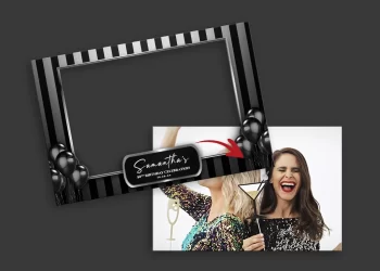
Photo Booth Templates elements and Dimensions
Photo Booth Templates elements
- Background: This is the base layer, like the canvas of a painting. It can be a solid color, gradient, or a subtle pattern that gives the template its main vibe.
Borders: These are the lines or decorative edges that frame your photo, making it look neat and complete. Think of it like putting a nice frame around a picture.
Text: Words or phrases added to the template to convey information, like event names, dates, or fun messages. Choose fonts that are easy to read and match the theme.
Graphics/Illustrations: These are the fun images or drawings that decorate the template, like flowers, stars, or party hats. They set the theme and mood.
Transparency: This is the magic that makes parts of the overlay see-through so your photo can shine through underneath. It’s like cutting out holes in a paper to see the picture behind it.
Layering: Think of it like stacking sheets of paper. Each design element is on its own layer, and you can move them around without messing up the others. This lets you create complex designs easily.
Effects: (Layer styles) These are the little extras that add wow-factor, like shadows, glows, or textures. They make the template pop and look more dynamic.
Define the Dimensions
When learning how to create an overlay, understanding resolution is key. Think of it as choosing the right outfit for your photo party—get it wrong, and you'll be making last-minute wardrobe changes! Resolution is all about the size and detail of your image, measured in pixels. Pixels are the tiny dots that come together to make your digital masterpiece. So, check your software settings early on to avoid a pixel-sized headache later.
Popular Photo Booth Overlay Template Dimensions:- 4x6 postcard overlay templates
(1200px x 1800px)
- 2x6 strips overlay templates
(600px x 1800px)
- square overlay templates
(1600px x 1600px)
- instagram overlay templates
(1080px x 1920px)
Popular Photo Booth Overlay Template Dimensions:
- 4x6 postcard overlay templates
(1200px x 1800px) - 2x6 strips overlay templates
(600px x 1800px) - square overlay templates
(1600px x 1600px) - instagram overlay templates
(1080px x 1920px)
TIP:
Overlay dimensions are unique to each software, so be
sure to the right dimensions for your Overlay template
Overlay dimensions are unique to each software, so be
sure to the right dimensions for your Overlay template
Understanding Transparency
When diving into the world of overlay creation, mastering transparency is a must. Transparency in a photo booth template is like giving your design the power to play peekaboo—certain parts can be see-through or semi-transparent. This magical feature lets the photo booth background shine through, creating a seamless blend that looks as smooth as a well-choreographed dance. And here’s the pro tip: always save your overlay as a PNG file.
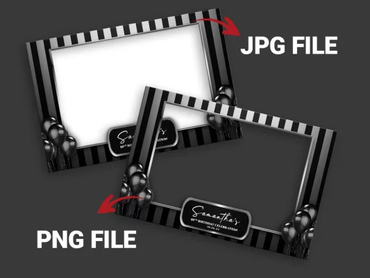
TIP:
buying a professional overlay template is best to learn design.
buying a professional overlay template is best to learn design.
the right designing software...for you
When learning how to make photo booth templates, you'll find plenty of software options at your fingertips. Adobe Photoshop is a favorite among designers, though it can feel like trying to pilot a spaceship if you’re new to it. But fear not! Even if you're not a design guru, you can still tweak a purchased overlay with just a smidge of knowledge.
TIP:
Adobe Photoshop Photography package is super affordable
Adobe Photoshop Photography package is super affordable
why we recommend photoshop
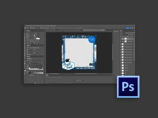
As a Photo Booth Business operator, you know the magic high-quality overlays bring to your customer's experience. But did you know there's a software that can take your creativity and editing prowess to the next level? Enter Photoshop! With Photoshop, you'll effortlessly edit PSD files, which are often included with overlay purchases. It empowers you to make small tweaks, like adjusting saturation, and of course text.
basic design rules you should follow
Creating a photo booth overlay template is like crafting a delicious recipe—it requires a good mix of graphic design principles and a dash of typography know-how. Here are some handy tips for photo booth owners to spice up your designs:
Simple and Clear Designs:
- Limit Your Elements: Stick to a few key graphics and text. Too much clutter can distract from the photo itself.
- Choose Readable Fonts: Opt for clean, legible fonts that can be easily read at a glance. Avoid overly decorative styles that might confuse the viewer.
- Use Contrasting Colors: Select colors that stand out against the background. High contrast makes your text and graphics pop!
- Maintain a Balanced Layout: Distribute elements evenly across the overlay to create a harmonious look. A well-balanced design is pleasing to the eye.
- Use High-Resolution Images: When you try to resize a low-resolution image, it often turns into a pixelated mess—think tiny, blocky squares that look more like a game from the ’80s than a beautiful photo. In contrast, high-resolution images can be resized without losing quality, keeping your designs looking sharp and stunning. So, choose wisely and let those high-res images elevate your overlays!
- Alignment: Proper alignment not only enhances the overall aesthetics but also conveys a sense of professionalism and care in your work. Viewers often subconsciously associate neat, aligned elements with higher quality and craftsmanship. So, take the time to align your components—your designs will thank you, and so will your clients!
The Importance of Typography and Alignment
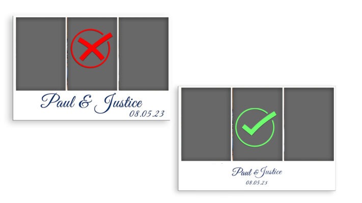
Ignoring typography hierarchy and alignment can make your design seem like you didn’t care about your client's event. When text and elements are poorly arranged, it sends a message that the details don't matter. After all, a polished design speaks volumes about the importance you place on their special moments! Sloppy Designs Say 'I Don’t Care'—And Your Clients Deserve Better!
Your Overlay Should Highlight the Photo
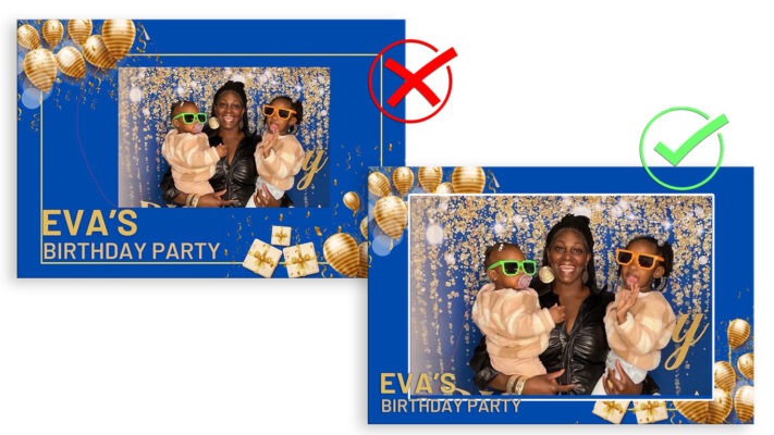
Ignoring typography hierarchy and alignment can make your design seem like you didn’t care about your client's event. When text and elements are poorly arranged, it sends a message that the details don't matter. After all, a polished design speaks volumes about the importance you place on their special moments! Sloppy Designs Say 'I Don’t Care'—And Your Clients Deserve Better!
Quick Links
Copyright © 2025 Eyelykit Studio
Powered by Eyelykit Studio
Powered by Eyelykit Studio

