why using
canva
could be hurting your business
canva
could be hurting your business
Ensuring Professionalism In Custom Canva Creations
In the age of DIY and cost-saving hacks, Canva has become everyone’s go-to for creating photo booth overlays and other goodies. While some strike gold with their designs, many unknowingly create design disasters. Crafting photo booth templates without any graphic design skills might seem wallet-friendly and easy-peasy, but beware! There are pitfalls that could tarnish your reputation, baffle your customers, and knock your competitiveness down a peg.
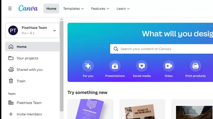
what is canva?
Canva is a versatile tool that caters to a wide audience, from small business owners and marketers to educators. Its ease of use and powerful features make it a go-to choice for many who need to create professional-looking designs without the steep learning curve of traditional design software like Photoshop.
The Allure of Canva
Canva is user-friendly and accessible to anyone, regardless of design experience. It provides a free option with numerous templates, making it an attractive choice for budget-conscious business owners. With drag-and-drop features, designs can be created quickly and without much hassle.
The Potential Pitfalls
Using Canva might not always result in professional-quality designs. While Canva provides a variety of templates, these templates are often generic and can lack the finesse and uniqueness of a professionally designed overlay.
The Pitfalls of Using Canva
for Photo Booth Overlays
for Photo Booth Overlays
Understanding your worth is about more than just crunching numbers—it's about building relationships that last. When it comes to Navigating Photo Booth Pricing, it's essential to master the fine art of communication, perfect the science of consultation, and embrace customer-centric practices that not only highlight your value but also boost client satisfaction and loyalty. Unlock the true potential of your photo booth business. Your worth is your secret weapon; let's turn it into your business's superpower.
- Unprofessional Appearance: Poorly designed overlays and animations can make the overall appearance of the photo booth unprofessional, potentially reducing its appeal to customers. Designing overlays without proper graphic design skills can lead to a lack of professionalism. Elements might not align correctly, colors may clash, and fonts might be inconsistent, creating an overall unpolished look. This lack of professionalism can deter potential customers who are seeking a high-quality and visually appealing experience.
- Ineffective Brand Representation: A poorly designed overlay may fail to represent the brand effectively. Inconsistent use of colors, fonts, and logos can create confusion and dilute the brand message. A strong brand image is crucial for any business, and a photo booth is no exception. Customers are more likely to remember and recommend a booth with a cohesive and well-designed brand presence.
- Negative Perception: Customers often associate the quality of the visual elements with the overall quality of the service. If the overlays and animations appear amateurish, customers might assume that the entire photo booth experience is subpar. Negative perceptions can spread quickly through word of mouth or online reviews, impacting the booth's reputation and potential business.
- Unappealing Aesthetics: Designing overlays requires an understanding of aesthetics, composition, and color theory. Without these skills, the resulting overlays may look unattractive or outdated. In a visually-driven industry like photo booths, aesthetics play a significant role in attracting customers. Unappealing designs may fail to capture attention and may even deter potential users.
- Limited Customization and Creativity: Canva is a user-friendly platform, but it has its limitations when compared to professional graphic design software. Owners may find themselves restricted in terms of customization and creativity. This limitation can result in generic or cookie-cutter designs that fail to stand out in a competitive market. Customization is crucial for creating a unique and memorable photo booth experience.
- Technical Issues and Compatibility: Inadequate graphic design skills may result in overlays that are not optimized for the technical requirements of the photo booth software. Issues such as incorrect dimensions, file formats, or resolutions can lead to technical glitches during events, causing disruptions and negatively impacting the customer experience.
- Time and Energy Drain: Learning graphic design on the fly can be time-consuming. Photo booth owners have numerous responsibilities, and dedicating significant time to mastering design skills may detract from other critical aspects of running the business. Time spent on design could be better utilized for marketing, customer service, and business development.
Graphic Design 101:
Top 10 Canva Tips for Beginners
Top 10 Canva Tips for Beginners
Here are some basic graphic design tips to help you create stunning photo booth overlays, even if you have little design experience. From choosing the right fonts and colors to understanding layout and balance, these tips will make your designs look professional and eye-catching. Dive in and start designing with confidence!
- Stick to Two Fonts: Keep it simple. Mixing more than two fonts can make your design look like a ransom note.
- Color Harmony: Use colors that get along. Think of them as guests at a party—you don’t want them clashing!
- Keep It Balanced: Symmetry is your friend. Think of it as giving your design a nice, warm hug.
- White Space is Golden: Don’t fear the empty space. It’s like the silence between jokes—it makes everything else pop.
- Consistent Alignment: Align text and elements properly. Imagine them standing in a straight line, ready for inspection.
- High-Quality Images: Blurry photos are like soggy fries—nobody wants them. Use clear, high-resolution images.
- Readable Text: If your grandma can’t read it, neither can anyone else. Choose fonts and sizes wisely.
- Mind the Margins: Give your elements some breathing room. Crowding is only fun at concerts, not in designs.
- Simple Backgrounds: Avoid busy backgrounds. They should support your design, not wrestle for attention.
- Stay Consistent: Use the same style throughout. Consistency is key—like keeping your socks matching.
The Importance of Typography and Alignment
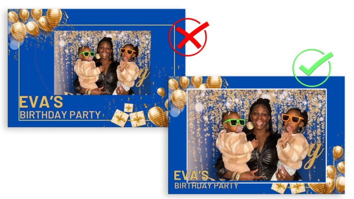
Ignoring typography hierarchy and alignment can make your design seem like you didn’t care about your client's event. When text and elements are poorly arranged, it sends a message that the details don't matter. After all, a polished design speaks volumes about the importance you place on their special moments! Sloppy Designs Say 'I Don’t Care'—And Your Clients Deserve Better!
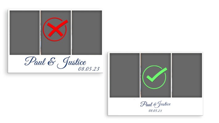
Your Overlay Should Highlight the Photo
Ignoring typography hierarchy and alignment can make your design seem like you didn’t care about your client's event. When text and elements are poorly arranged, it sends a message that the details don't matter. After all, a polished design speaks volumes about the importance you place on their special moments! Sloppy Designs Say 'I Don’t Care'—And Your Clients Deserve Better!
Quick Links
Copyright © 2025 Eyelykit Studio
Powered by Eyelykit Studio
Powered by Eyelykit Studio

